This is a semi-paper cut using the earlier study from primary imagery. Again, fine liners were used for the lines, and some areas of the portrait were cut out. The lines were generally in the style of Lizzie Mary Cullen's work, particularly the psychogeographies series. In the hair, I have used continuous lines to convey the hair textures as realistically as possible. In other areas, including the the coat, I used zig-zag lines, and cross-hatched in the eyes.
In this experiment, I've taken it a bit further. The majority of the hair has been cut, leaving room to add more continuous lines for the hair. In other areas, such as the coat, I used cross-hatched lines, and directional lines, and even drew a pattern of vertical and horizontal lines. This is one way of bringing depth to the paper cut, as it combines two techniques.
Using the same image a third time. Instead of drawing the lines, i used coloured card as a backdrop. Bright colours like yellow, green and orange were used. The colours do add some depth to the paper cut.
Another paper cut, a different image to work from. Once again, the coloured paper was the backdrop in the exposed areas, using the same bright colours.
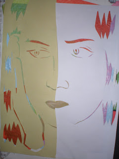
This time working from another picture. With this, I used two different types of paper, the right being ordinary printing paper, and the left being sugar paper, which gives a rather distorted look. The backdrop was tissue paper instead of the coloured card this time.


No comments:
Post a Comment