MY RETAIL GRAPHICS PROJECT CHECKLIST
Japanese sweets logosMoodboard
MindMap
4x Logo Analysis
Initial Ideas: Logo - A1 sheet of mounted drawings
Logo Development: fineliner
Logo Development: Illustrator
Logo Development: cross stitch
Packaging nets
Packaging Analysis
Japanese packagingInitial packaging net
Christmas Homework
Targets
Packaging development
Swing tag developments
Final Packaging Net + annotation
Final completed swing tag6 Examples of swing tags + annotation
3 in depth analysis of swing tags
Showing posts with label unit 1. Show all posts
Showing posts with label unit 1. Show all posts
Friday, 27 January 2012
Tuesday, 24 January 2012
RETAIL GRAPHICS PROJECT EVALUATION
For this project, I had to create and design some packaging, logo and swing tag for a my chosen fictional shop, which was a sweet shop with a Japanese theme. I decided to call this shop 'Okashi' meaning 'sweets' in Japanese. In order to gather ideas for this, I looked at numerous Japanese sweets and packages, and how the packages were constructed, as well as the typical surface designs.
At first, it started with deciding which type of retail we wanted to work on, on which I decided to do a Japanese sweet shop, then creating a logo, then creating a net for the packaging, which I changed overtime,due to it not looking very professional when constructed, so I ended up creating a totally different net. Also, parts of my original surface design had to be changed, such as the smiley faces, in order to be in the style of the 'kawai' Japanese smiley faces. This was only found out, when comparing my original surface design with those found on a Japanese package.
My inspiration for my final outcomes came from different sweets packages such as Hi-Chew, Kinoko no Yama, and from swing tag companies such as Blossom graphic designers, from the use of bold and vibrant colours.
In my opinion, I think the fastener on top of the package came out well, as it fastens quite well, the design itself, also looks aesthetically pleasing, and I personally think it is a lot like a Japanese packaging. Also, the swing tag goes well with the bag, as it incorporates the same surface design, including the logo, as well as providing information of the shop, including the website.
However, there are some aspects which could have been improved. Firstly, the fastener could have been a little bit more secure, as there is a tiny gap. Also, the straps on the bag could have had a design on the inside, and they can get in the way of opening the fasteners.
In conclusion, I found this project quite challenging, but in a good way, as it pushed me into trying to make my packaging the best it could be, and also including the fastener, which took some time to work properly. And if given the opportunity, I would like to make some more packaging, but maybe for a different shop and theme.
Monday, 23 January 2012
FLUFF AND FUZZ ANALYSIS

Images from the Fluff and Fuzz website
These swing tags are made by an artist who goes under the name of Fluff and Fuzz. At a young age, the artist was taught how to knit, and later continued on with it later on in life, which may explain the reason for the choice of method. These swing tags are instead sewn rather than knitted, and may have been used for packaging or just made out of leisure, and were recently made in 2010.
As mentioned before, the artist behind these had sewn these tags, as she wanted to use an alternative to cardboard, and maybe because it was a part of her speciality. The scale may have been rather small, as they are meant to be smaller than the packaging itself. In addition, the artist uses different patterns in her work, which are mostly floral patterns, which may be to vary the style, however, the composition of the tags remain, which include her persona and her real name with a small illustration of a ball of yarn and a pair of knitting needles, the same in each tag she designs, almost like a house style. Also, she seems to use the same sewing pattern in each tag, so the pattern of the stitches remains the same. This may be to identify her work by the pattern, distinguishing her work from other artists.
I like Fluff and |Fuzz's tags, as she uses an alternative material, making it softer to touch and more distinguished from other swing tag manufacturers. Also, as they are made from a different material, it may convince someone not to get rid of them, as with many other swing tags. In my opinion, this is what makes the work valuable. To some degree, it is an inspiration, because of the distinguished style, however, because my target audience may be different to hers, the design of my swing tag may differ, and would involve more illustrations on the surface.
LEMON PIE SWING TAG ANALYSIS

Image found on the Blossom website
This is a swing tag, designed a for gift store named Lemon Pie. When it was designed is unknown, but it was made by a hang and swing tag company named Blossom, and it was possibly designed to be accompanied with packaging.
This swing tag may have been made by using specialist programs such as Adobe Illustrator, including the text and the graphics, possible by the use of techniques such as the Clipping Mask, although this remains unknown for sure. The artist behind this method may have chosen this in order to make the tag look professional and refined, as well as aesthetically pleasing. The scale of the tag may not be too big, as it may take away attention from the actual product, and the composition of the text and graphics seem to be structured in an organised way, and avoiding putting too much information on the tag, as the audience may not read all of it. In addition, the use of colour is quite limited, only using a hint of red for the ladybird and brown, and mostly cool colours such as light blue, green and hints of electric yellow. Also, most likely for decorative purposes, the tag includes lots of swirly lines and patterns, which does creates some sort of flowing movement.
I do hold this swing tag design in high regard, as it is aesthetically pleasing, as well as having a professional look and feel to it. The use of swirly lines and the patterns brings the piece together,making the design look elegant, and the butterfly and ladybird are a nice touch. Also, there isn't too much or too little in the swing tag, to avoid confusing or overwhelming the audience with too much information. To some extent, the design of this swing tag does serve as an inspiration to my own design of a swing tag. However, as my target audience and shop may differ from this one, so my design will include a lot more in it in terms of bold colours and more 'in your face' elements.
FLOWPRINT SWING TAGS ANALYSIS

Images found on the Flowprint website
These swing tags were designed by a package design company named Flowprint. These tags were to be accompanied with food and toiletry gifts, in order to enhance the self-image, as well as carrying information about the product. However, when it was made is unknown.
As with many sing tags, the composition of these tags is organised in such a way that avoids having too much text, and the use of colours vary from warm to cool. This may be because of the different products that they accompany. In order to design these, programs such as Adobe Illustrator and Adobe Photoshop may have been used, to clean up the appearances. Techniques such as the Clipping Mask and the Text on a Path may have been used to complete the design. although this is not for certain. The scale of these is most likely to be quite small, so as to not distract the audience from the product itself, and due to their target audience, which may be young children, as seen with the Little Fairy tag, the design has avoided having sharp edges, to prevent potential injuries. Among the designs, the use of colour is mainly that of cool colours, such as blue and green, with hints of yellow. This may be due to the target audience.
I like these designs as they seem to advertise their product or company, as well as having simple and effective designs, making them easier to understand for their target audience. The use of colour was chosen well, as they are colours that would attract to young children, such as the pink used in the Little Fairy swing tag. This serves as some inspiration to my final swing tag, as my intended audience may be the similar as these.
Sunday, 22 January 2012
SWING TAG EXAMPLES

One: Fluff and Kuzz Two: Flowprint swing tags, Three: Made It swing tags Four: Young food heroes swing tag, Five: Paprika swing tag, Six: Sen.9 swing tag
Saturday, 21 January 2012
FINAL COMPLETED SWING TAG

The star design in the centre is my final completed swing tag. The design on the left is the front, and on the right is the back of the swing tag. I incorporated the same design as seen on my net, so that they match, and the logo is also perfectly round and coloured in. The design above it will be used to instead of string, to make it more interesting and appealing. As mentioned before, I wanted to add a a page containing some text about the shop, instead of just having a front and a back. Underneath, there are the contents page, including text.
FINAL COMPLETED NET

SWING TAG DEVELOPMENT


This was my first idea of a swing tag. Although the colours are bright and it goes very well with my packaging design, it was too overwhelming, due to too much text. So I would later go on to change the design, by taking off the text and adding in the logo. After doing this, I incorporated the logo, however, the shape wasn't entirely perfect, as the lines were wobbly, so I re-created the logo in Adobe Illustrator, which would be used on the final net and the final swing tag. The third image is a part of my final swing tag, the re-created logo is featured on the front of the swing tag, which I intended to stick together. However, I decided that I wanted to have some text with my swing tag, and this would be used in the final swing tag. The pattern above the star shapes will be used instead of ordinary string to tie on to the packaging, to make it look more interesting.
Wednesday, 18 January 2012
DEVELOPMENTS OF NET


These are my net examples. The first one was my first net that I wanted to go with as a final completed design, but it decided that I didn't like the look of it and when it was put together and didn't look very professional. So I created the second one, with the same repeated star pattern, and a similar design, but just a different shape, and fasteners. Although, this was a good shape to go with, I wanted to develop the surface design even further. Also, the logo in the centre didn't look as nice as the other smiley faces, as the lines looked wobbly, the circle wasn't exactly perfect, so I would need to make the logo in Adobe Illustrator, in order to correct this problem. So I went on to do this, in my final completed net. However, the writing in the centre of the net, placed behind the logo would blend in too much with the logo when printed out, as they were the same colour, and it would be difficult to distinguish the two. To correct this, I would either need to change the colour of the writing, or the colour of the logo. I decided to change the colour of the writing.
Wednesday, 4 January 2012
MY NETS SURFACES


These are a few experiments with the surface of my net. I used different methods and different designs, which were inspired by artists such as Linda Kittmer, Sally Harmon and Clark Goolsby, Jim Stoten, Hennie Haworth and Jakob Runge. I used recycled paper by tearing them into thin strips, and sticking them over the other, making sure that they overlap. I also made some interesting shapes to go on the surface of the net. I used some watercolour paints and drew cute little characters to make it more interesting. I also used a typography design, writing the same word, but using two different typefaces. Another was a felt tip illustration, where I used bold and vibrant colours to make different patterns.
Tuesday, 13 December 2011
INITIAL PACKAGING NET

This is my initial packaging net. When constructed, it will become a basket for putting in chosen sweets. The little rectangles will become the strap for the bag, and the two bigger flaps will become the fasteners.
Monday, 12 December 2011
PACKAGING ANALYSIS

This is an analysis of a packaging created by an organisation known as 'Voice'. They created a package for a company called 'Velocita', who sell organic coffee beans. 'Velocita' is Italian for 'speed'. It uses a limited amount of colours, mainly consisting of the brown colour of the packaging, but with other colours including blue, yellow and red. The text included in the packaging, including the company's name, is bold in order to convey their name across quickly to a mass audience. On the surface of the box, contains information such as the date it was imported, the contents of the package and the weight of the contents. The packaging creates this industrial but natural persona of the company.

MORE PACKAGING NETS


These are some more examples of packaging nets, only more complex. They are nets of actual packages such as bags, and different types of fastenings
Sunday, 11 December 2011
PACKAGING EXAMPLES

Tuesday, 6 December 2011
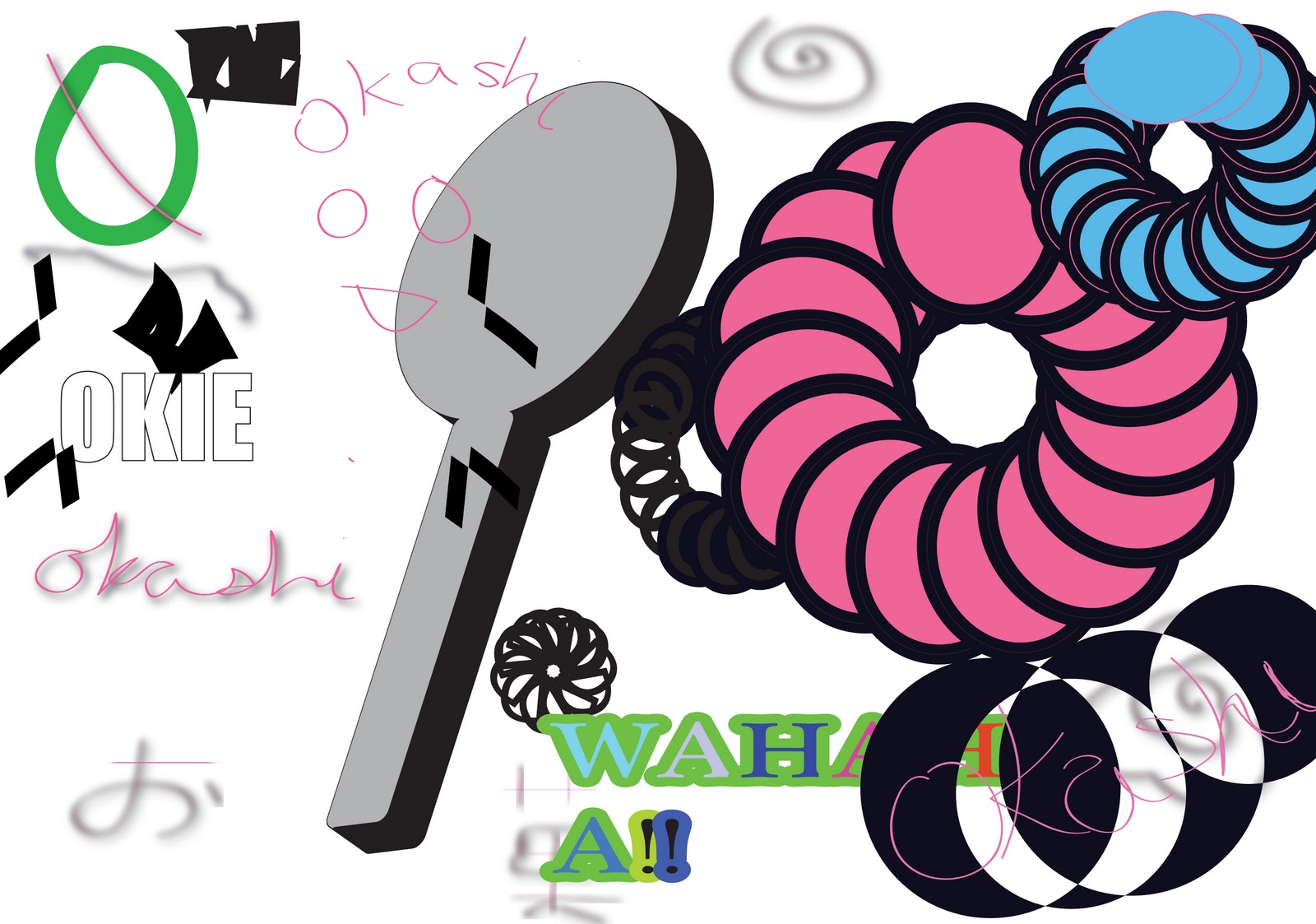
LOGO CROSS STITCH

This is my logo using a cross stitch effect. Using a cross stich-like background, I set a scanned picture of my logo behind the cross-stitch background, and coloured the cross stitches individually. I used vibrant and bold colours, as my logo is for a sweet shop and the colours used are linked to a sweet shop. I then removed the cross- stich background and it left this design. The background acted more as a guideline to help me achieve this.
Monday, 5 December 2011
LOGO DEVELOPMENT-ILLUSTRATOR


These are some logo experiments which were done using Adobe Illustrator. I used techniques such as 3D revolve and repeating shapes, as seen in the top experiments. I also tried typing out the name of my shop and then adding some decorative stars around it, as well as having different letters in different colours, surrounded my brightly coloured shapes, also decorated. I did the same, but using a different typeface, and different decorations.
Sunday, 4 December 2011
LOGO IN FINELINER

Friday, 25 November 2011
LOGO ANALYSIS- MINAMOTO KITCHOAN

Minamoto Kitchoan is a sweet shop, that sells Japanese sweets, and is found in London, New York, San Franisisco, and Singapore. The logo consists of a red background with Japanese text, written vertically with a ring surrounding it. Next to it is 'MINAMOTO KITCHOAN' in black big case letters. The logo itself is typo and graphic, because of the text and the ring around it. They look like they had been drawn with a traditional Japanese calligraphy brush, which gives off the effect of a dry paintbrush, and that it is mainly used for the shop fronts instead of it being on the packaging itself. The colour red is a prominent colour in Japan, so it may have been used to reinforce the Japanese theme, as well as the writing itself. It's a very simplistic design, and there aren't any surrounding images or text, as it would take away the attention of the writing. The accompanying text, is written in a Serif, which gives it a classy and posh look. The target audience is quite broad, as there are products which are suitable for children, as well as adults. Because of its simplistic design, I think it is a successful design, and it does draw the attention of the viewer. When creating my logo, I would incorporate some Japanese text, however, I would want to use bold and vibrant colours to make my design more complex.
Subscribe to:
Posts (Atom)