Friday, 30 November 2012

PRIMARY IMAGES

These are the primary images (pictures I took myself) that I will be working from. I will use them experiments such as illustrations, paper cuts and collages.
I asked the subjects to look forlorn and troubled- something was bothering them.

Close-ups of subject. A good sign of  human emotions is through the eyes, so I thought that a close-up of this area would be a good idea to study from.

Another close up of the eyes.


Another subject deep in thought.

ELABORATE PAPER CUTTING MOODBOARD

Tuesday, 27 November 2012

PROJECT BRIEF


This is my brief for this personal project. This outlines what I am creating, the theme behind my outcome and who the client is. As mentioned before, there has to be a link between this project and the CD project, and this is mentioned in the middle grey box. Also some artists that I will be looking at for inspiration, including Lizzie Mary Cullen, Julene Harrison and Leandro Senna.


MOODBOARD OF ILLUSTRATIONS


This is my mood board of illustrations, particularly fine liner drawings. These were from different sources, including Leandro Senna and Ugo Guttoni. When making this mood board, I made sure to only include black and white drawings.

Friday, 23 November 2012

LIZZIE MARY CULLEN


Image from the Lizzie Mary Cullen website

This is 'Trafalgar Square' illustrated by British artist Lizzie Mary Cullen. It is one of mary drawings of the 'London Psychogeographies' series most likely created for exhibition purposes. Cullen, who was born in Scotland has done award-winning illustrations for clients such as the Independent newspaper, BBC and MTV. This, along with other drawings of the series is a depiction of a famous attraction spots in London, this one being of the world famous Trafalgar Square. The reason for analysing this piece is because it will inspire my outcomes of a series of posters, some of which will be illustrated in this style.

According to her official website, Cullen expresses London as "an expressive urban maze whose sensuous, dark and mythical history is echoed throughout the city" and may have been the main source of inspiration for this series.The purpose for creating these psychogeographies was to "combine reality with my (her) own interpretations of space", which explains why the buildings and the surroundings are the way that they are- disproportionate and not quite up to scale. From this, the possible theme may be that of London, or a psychedelic London, as it bears some resemblance to psychedelic hallucinations. She has used a range of repetitve textures throughout the piece to convey some sense of realism, as seen with the road and the pavement.  When using radiographers and fine liners and Unicorn hide paper, she may have achieved this using short and long marks with these, as well as using long and wavy lines for the sky, and a few hints of cross-hatching, which is obviously her style. Had she not used well-known building such as the neon signs of Sanyo, TDK and Fosters, or even provided the title, the illustration would have been difficult for the audience to identify.

When I first saw the illustration, I found it hard to identify the city until I saw the title. When I saw it, I tried to look for buildings that are found in Trafalgar Square and then it made much more sense.
As previously stated, I would like to use her style in some of my philosophical posters for my personal project. She uses repetitive patterns frequently in her work, which I want to use as this technique links back to the CD project, where I used repetitive patterns for the surface designs. In a way, there is some resemblance with Billie Jean's illustrations which are also monochromatic, and have some sense of realism in them but she don't use any repetitive patterns and her illustrations don't quite fill up the page like Cullen's. But in general, I do hold her work in high regard, because of the effort that she puts in each of them.


Thursday, 22 November 2012

JULENE HARRISON


Julene Harrison is a British artist who specialises in paper cutting and illustration. According to her official website, Harrison was originally a textile designer and had decided to do paper cutting only a few years ago. This is an example of her paper cutting work called 'The Best Thing in Life Aren't Things' and was made in 2011 for private commission purposes. It was most likely made for a private client, hence the text at the very bottom of the piece 'Emma & Ian Forever Together'. I have chosen to analyse this piece because it is a style that I would like to imitate for my series of posters for my personal project.

Her background in textiles has certainly been a major influence in her paper cutting art, as she may have worked with patterned textiles which inspired her, and continues to incorporate these designs in her current work. As you can see, she has used a white ground, which may have been a strong card for the sturdiness, which is good for laying it against a dark background, like she has done. For the cutting itself, she has used a cutting knife to achieve those precise cutouts and lines. If she had used scissors, the design would not have been as convincing and engaging. The long and continuous lines may have been a result of making a long cut out of the paper, without lifting the knife off of the page, whilst other lines, such as the sun rays at the top, or the bridge on the right hand side look like dynamic and quick cuts. It's also important to create bridges between the paper so as not to ruin the effect, and Harrison has clearly used bridges to connect the design to the surrounding border. The scale of the piece is unknown but it would be safe to assume that is is A4 size (297x210mm), as this is the conventional size for paper cut pieces. In addition, cutting with a larger size paper would be time consuming, and probably wouldn't contribute to the quality of the design. Around the text, there are images of various objects including an old Volkswagen car, a convertible, a tent and the UK flag. These objects may be personal for the clients, aspects of that are important to their identity.

When I first saw the piece, I was amazed at the precision of her cuttings, and how they resemble real objects really well. She just makes it look very easy. I thought that the border is a nice touch as it ties the whole design together.As I stated before, I want to copy this style and technique for a poster with loneliness as the theme for my personal project. When I make it, I wanted to use the same sinuous lines and precise cuts that she uses, as well as the uppercase bold typeface that she places in the centre. However, when I come to produce it I may or may not have the text in the centre.


Wednesday, 14 November 2012

MINDMAP OF INSPIRATIONS


This is my mind map of ideas for this new Personal project. Some of these ideas include making a poster of quotes of influential musicians, or a t-shirt with direct and honest messages. At this point, I don't know exactly which idea I will take forward, but for now I have come up with a few, so I can pick the one I want to work with at a later stage.

MOODBOARD

Tuesday, 13 November 2012

INITIAL IDEAS

These are my initial ideas for the new personal project.


NEW PROJECT

From now on, I will posting blog post on the new project, the PERSONAL PROJECT. So keep a look out! 
This project will have some sort of link to the CD project, whether it be through techniques used, the subject matter etc.
Hopefully it will be a good one!

Monday, 5 November 2012

MY FINAL PACKAGING

These are my final CD packages! The top image is the package where the Cd ROM will be, and the image below is for the inlay containing the lyrics to the song.

It has not been plain sailing, but I got there in the end. 

The inlay package open containing inlay

CD packaging with CD ROM inside. There's also the QR code on the bottom of the CD, which I posted earlier.
Because I finished early, I managed to complete an extension task- creating a t-shirt design. I used one of my earlier artwork developments, and via heat transfer, managed to put the design on to the top.
Back of top- The Will Smith logo.


FINAL EVALUATION

For this project, I had to create a CD packaging, surface designs and a logo for an existing artist and song. To come up with some ideas, I created a mind map of my favourite songs and artists. I finally chose to go with 'Summertime' by Will Smith because it had a summer theme to it, but at the time, my decision wasn't definite.
Next, was the creative process, which involved various experiments of techniques that are commonly used on CD covers, including screen printing, stencil work, typography posters, vector images, which were created either by hand, Illustrator or Photoshop. Later on, I used other techniques which were mostly created by hand, like drawing the artist and taking photos of objects that were mentioned in the lyrics, sketching these objects.
After this, I was finally sure that I was going to go along with 'Summertime', so I began to create various logos that I could use throughout the project. I used many mediums, such as pastels, charcoal, Indian ink and paint even on Photoshop. I finally chose to work with this logo, because the letters were of different sizes, and this was typical of at the time the record was made. The colours were bold and this goes well with the summer theme. Next, on to the packaging. I began creating a moodboard, of surface designs, other existing packages, the lyrics and my final logo to be included on the packaging. This lead to experiments of potential packaging using different materials, including recycled packaging, fabric, magazine pages, envelopes etc. This lead to bookbinding experiments, for the little booklet that is usually included inside of a CD package, so I tried out stapling and sewing, and then onto the surface artwork, which was mostly techniques used in Photoshop, including the grunge texture, the personal wallpaper and the seamless repeating pattern. From this point on, the focus of the project was to narrow it down to doing experiments relevant to my own individual project. This would later help me in my own self driven experiments- experiments which I thought are relevant to my chosen song such as my bold repeated patterns created on COLOURLovers.com, vector images created from my own photographs etc. On to the packaging, I started to create some 
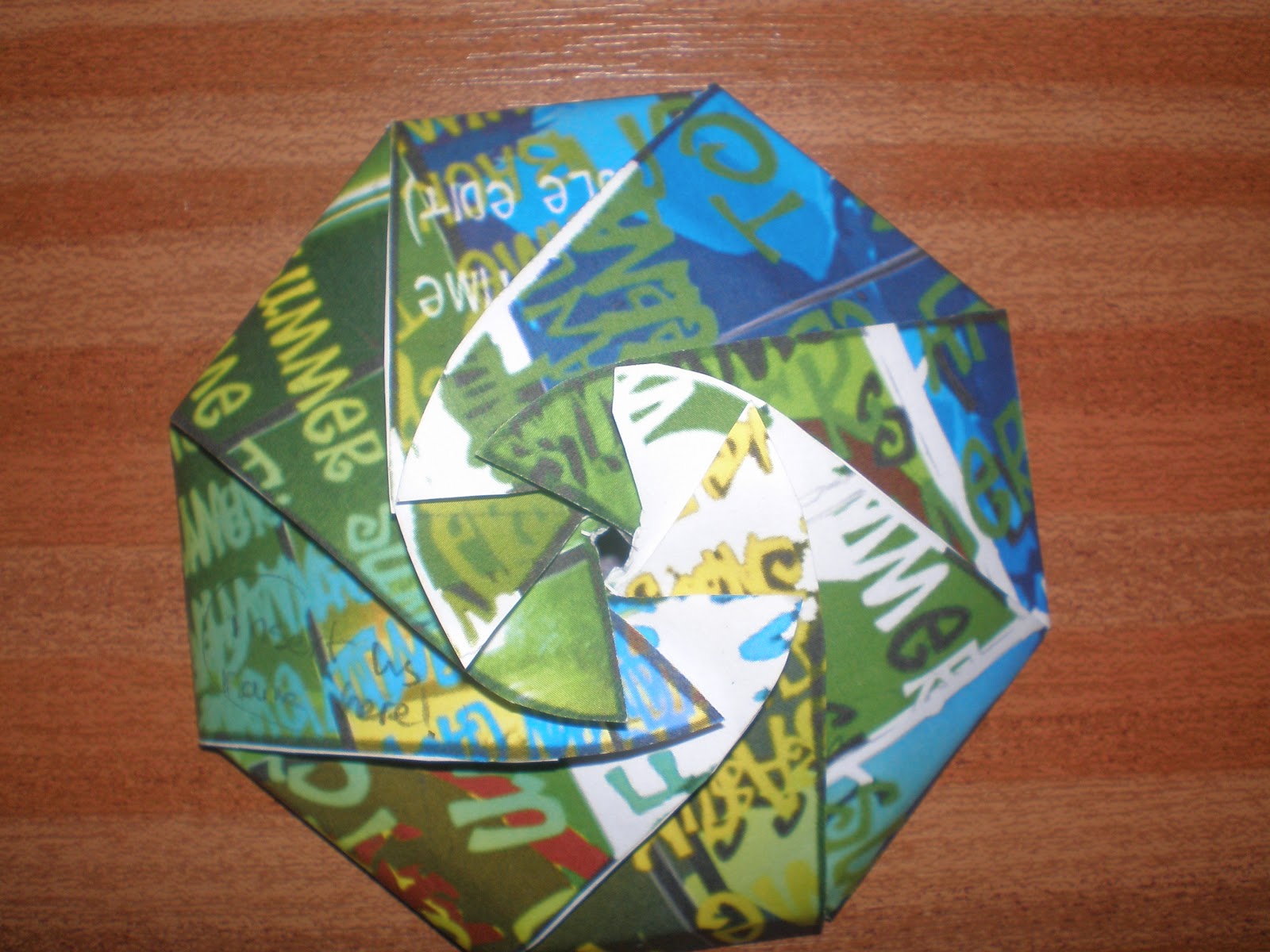
protoypes which could potentially be used in my final outcome, and I eventually chose the 'Wowspiral' originally created by the company 'Wewow'. I thought this packaging was clever and economical, especially as only one piece of card was needed, and the circular clasp made when closed looked quite nice. And my final surface design for the CD package was a combination of  vector images of Will Smith, a pair of sunglasses and a pair of Converse trainers as aspects mentioned in the lyrics, and the use of the typographic defined brush, all created in Photoshop. But, I came to realise that I had to create another surface design to go on the inside of the packaging, so I created on using the same program, but instead i used the Gradient tool, using bold colours such as green, yellow and orange, as well as the tracklisting. If I had used the same design for the exterior, then the customer would be too overwhelmed with the design. Next, I would need to create the same packaging for the inlay, which I decided was going to be lyrics for the song, that the customer could sing along to. So, I created an exterior and interior surface design using the repeated patterns from COLOURLovers.com, and the Gradient tool from Photoshop. My main influence for this was from Gillian Blease's repeated pattern, which had the bold and vibrant colours, as well as geometric patterns that would have been popular during the 90s. I thought it would've been a good idea to have two different surface patterns for the two packages so that anyone could tell the difference.
Overall, I thought that the project was success, because I knew exactly what I was doing and how I was going to assemble the whole package. When I tried assembling the Wowspiral for the first time, it didn't come together the way that I wanted it to, but after practising it for a while, it managed to assemble it successfully, especially with the circular clasp. However, as with anything, there are some things I could have added to make it better. One of them being that I could have a different colour on the CD package exterior instead of using black. Also, the circular clasp on the CD package didn't work out as well as I had wanted it to, the inlay package turned out to be a bit better.
I found the project generally pleasant. I quite like packaging so it was fairly easy to come up with ideas and create. The project did show me some new techniques, especially when it came to surface artwork designs, one of them being the opportunity to make your own patterns at COLOURLovers.com, the grunge texture experiment, and the vector images experiments. As I mentioned before, I like creating packaging, so I wouldn't mind doing a similar project again for the next PERSONAL PROJECT.

Thursday, 25 October 2012

CD DESIGN


This is my CD design of the Summertime CD. The gradient is that of green and yellow similar to the other gradients used on my packaging. The logo is in the background and has been made to have a fadey appearance from selecting 'Overlay' from the drop down menu under the Layers tab. Also, there is the QR code that I posted earlier, so that the customer can scan it using their smartphone.

MY QR CODE


This my QR code for this blog, which I most likely use for my final packaging.

SURFACES FOR SECOND PACKAGING


These are my designs for my second packaging which will be for containing the inlay. They both have repeated patterns, and the similar gradients
This will be used to go on the inside of the packaging. It's simple but effective, but I'm thinking of including some notes of appreciation, as if sent by the Smith himself. For this effect, I chose the option 'Soft Light' from the drop down menu under the Layers tab, which resulted in this.


This will be the exterior surface. I brought in the repeated pattern in Photoshop, and under the drop down menu in the 'Layers' tab, I chose the option 'Difference', resulting in this. It looks like the gradient is actually inside the headphones and rainbows as well. I'm also thinking of including some sort of message like 'Open up', or something on the lines of that.

Tuesday, 23 October 2012

PROTOTYPE OF FINAL PACKAGING

These are some shots of prototypes of my final CD and inlay packaging. Before making the final model, I wanted to be sure that it actually works, so I made these.

Side view of packaging when closed. This packaging would be used to hold the CD, but another separate one would be used for the inlay poster. Looks quite good, the circular clasps seems to work well, and the surface design is bold and colourful, which is good for the summer theme.

Front view of closed packaging. There are a few minor problems though. First of all, the artist's name can't be seen anywhere. So how would the customer know it's a Will Smith CD, or that it's 'Summertime'? I need to include a name somewhere on the flaps in a particular spot so that the name and the title of the song can be seen easily. Also, I need to include a bar code on it, as if it were being purchased at a shop.


Packaging opened. Looks a bit like a spider...

This is my second prototype. The white ring around it is supposed to be a makeshift spine, that is typically seen on CDs. When the time comes to assemble the real thing, it won't be anything as lousy as this, but similar. 


Maybe if I made the spine a bit thicker, it could work effectively. 


FINAL LYRICS INLAY


This is my true and final lyrics inlay. The background is vibrant with a yellow, green, orange and red gradient, with a repeated overlain pattern made from ColourLovers.com. The colour of the text is in black and the font used is 'a ripping yarn too'. which was the font used for the typographic brush. I did manage to fit all the lyrics of Summertime onto the page (and I jumped for joy!) 
The black font against the vibrant colours make it easier to read, and the size is also sufficient, so I'm really happy with it.

INLAY DEVELOPMENT


This was my first inlay design to be featured in my packaging. I intended to use the vector image of Will Smith that I created earlier, the typographic defined brush created in Photoshop and the lyrics of 'Summertime'. 
I really liked the image, it went well with the rest of my packaging. The only thing that was bad, was that I couldn't fit all the lyrics on. If I made the text smaller, it won't be seen very well, and the colour of the text, no matter what I changed it to, blended in too much with the background. 

This was originally going to be my final inlay. I used a repeated pattern made on ColourLovers.com, and the typography defined brush from Photoshop. I also used a different font than the top one called 'Apple Casual', in white which made it slightly readable against the black background, but the typographic brush renders it unreadable, so the customer would find it difficult to read (or sing along to). So next time, I will make another lyrics sheet, but maybe using a brighter more vibrant background, with black as the colour of the font. The only challenge is making all of the lyrics of Summertime fit onto the page.


Friday, 19 October 2012

FINAL ALBUM ARTWORK


This is my true, final album artwork with my net overlain over it. I did this on Photoshop by putting my final net over the design, and then chose the option 'Linear burn' so that only the outlines could be seen, resulting in this. Now what's left is to add the logo, in the base of the the net.
This design will go on the exterior of my net.


As for the interior this will be the design. This includes the track listing and he logo. which has faded into the background. The gradient colours include green, yellow and orange which emphasise the summer theme.


Friday, 12 October 2012

ARTWORK DEVELOPMENT- PART 2


This is more development of my surface design. Originally, I planned for this to be my final design, but there were some minor things I didn't like about it that I thought would affect the design. The outline of the net couldn't be seen very well because of the black background of the design, and the text listing the track list on the flaps couldn't be seen very well because of the font used. The vibrant colours of the text of the design, I felt was good, it suits the summer theme really well. And I'm using the vertical panels as well, like I said I would. 

This was originally going to be the on the inside, whereas the outside was going to have a white background for contrast.
Like this.... Same design, but different background.


Thursday, 11 October 2012

ARTWORK & NET DEVELOPMENT


This is my final net overlaying my final artwork for the CD project. The net is that of the Wow spiral, originally created by packaging company 'Wewow', and the design uses an vibrant image of a pair of trainers/sneakers  in vertical panels (click here for this tutorial), and some typography of the 'Summertime' lyrics created from a typographic brush that I defined in Photoshop, with a black background to advance the colours, make them more noticeable.
This is good for the summer theme, because of the colours of the image and the text, and the net itself is quite swanky (if I may say so myself). What really draws me in is the light green in the middle of the design leading in to the orange.
But, there are a few things that I would change about it. In regards with the vertical panels image, I would much rather have vertical panel images of different aspects of summer instead of just an image of one object that Will Smith often talks about, so some panels, of a pair of trainers/sneakers, then a vector image of Will Smith and then someone wearing a pair of sunglasses. It would convey the message a lot better. Also, I need to add in my final logo in the centre of the net.


Here is another development of what I said I would do earlier. I have used images of Will Smith and a pair of sunglasses (you can only see one lens), as well as the trainers/sneakers from the first image. This is better, because I've incorporated the more than aspect of summer mentioned in the lyrics of the song 'Summertime'. Now, what's left is to use the typography defined brush in Photoshop and to incorporate the logo.
Also, I need to overlay my package over the design, to see where the design lies on the package.

Wednesday, 10 October 2012

GILLIAN BLEASE


These are the repeated patterns created by Graphic designer Gillian Blease. When they were created is unknown, but were most likely for commission purposes. I've chosen to analyse her work because it is similar to the repetitive patterns that I have created.

These were most likely created using a specialist software program like Adobe Illustrator or Photoshop, or possibly drawn by hand, scanned and then edited by using a program to clean up the appearance and fill in the colour. As you can see with the second pattern, there is a black background which allows the brighter colours to advance off the page. This is good for making the colours stand out, especially with the type of outcome that I want to create. It also resembles early video games graphics to some extent, such as Pacman or Tetris of the 80s. Whereas the first pattern has a lot of symmetrical shapes, uses a combination of light and darker colours, making it resemble a stained glass window. The use of geomteric patterns was quite a  popular design during the 1990s, and the dark purple background emphasises the stained-glassed window resemblance. 

I quite like the bright colours and the clean appearance that it has from working on computer,and I think it would be good to incorporate the aspects of her design that I have made a note of.

ALBUM ARTWORK DEVELOPMENTS

These are some developments I have done for the album artwork. One of these could potentially be featured on my final packaging.

For this version, I have used a repetitive pattern which I created in COLOURLovers.com, and used the typography brush technique that I had done before using the image of Katy Perry. I felt that the colours used were relevant for the summer theme because they were vibrant and bold. You can vaguely see the pattern amongst the writing. The only setback I have for this, is that the different sizes of the painting can stop the viewer from seeing the words.

This is a second alternative artwork design. I used my vector images of Will Smith that I created a while back, and placed them in different positions, using the top design as my background. In some places, I've used the Paint Bucket tool and filled with black. To have this faddy effect, I used the Linear Burn technique. This is a good idea and the effect of the linear burn is effective, but maybe if I used vector images of other objects, it could be even better, instead of just Will Smith vector images. That way, I'd be putting the summer message across.


This is another alternative using the typography brush once again, but with the vector image of a pair of converses. I used a black background, as this advances the bright colours, and used the typography brush in different colours. Unlike the first one, the viewer has a better chance of seeing the lyrics, so I slightly prefer this to the top one. The composition has just about the right amount of objects there without being too clustered, so I really like  this one.
This is another alternative, which uses the previous design, except the background is white, but the text is black with another colour. I did this with the Paint Bucket tool. Also, the pattern which I made on Colour Lovers.net was used, which I overlaid, resulting in this design. I thought that this was quite nice, and you can see the lyrics featured in the song, unlike the very first design. But I feel that this has too much going on and may overwhelm the viewer with colour.

REPETITIVE PATTERNS-colour lovers

These are some repetitive patterns that I filled with my own colours using COLOURLovers.com, a website where you can create your own palettes and patterns. I thought that these would be a good idea to be used for my final packaging, because of their repetitiveness. The only thing that I would say is bad is that it can be difficult for a beginner to create your own colours,  especially if you're not very experienced with Photoshop and Illustrator, because it works quite similarly to those two programs. But on the other hand, it does allow you to express yourself.