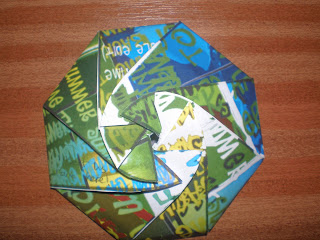
These are some shots of prototypes of my final CD and inlay packaging. Before making the final model, I wanted to be sure that it actually works, so I made these.
Side view of packaging when closed. This packaging would be used to hold the CD, but another separate one would be used for the inlay poster. Looks quite good, the circular clasps seems to work well, and the surface design is bold and colourful, which is good for the summer theme.
Front view of closed packaging. There are a few minor problems though. First of all, the artist's name can't be seen anywhere. So how would the customer know it's a Will Smith CD, or that it's 'Summertime'? I need to include a name somewhere on the flaps in a particular spot so that the name and the title of the song can be seen easily. Also, I need to include a bar code on it, as if it were being purchased at a shop.
Packaging opened. Looks a bit like a spider...
This is my second prototype. The white ring around it is supposed to be a makeshift spine, that is typically seen on CDs. When the time comes to assemble the real thing, it won't be anything as lousy as this, but similar.
Maybe if I made the spine a bit thicker, it could work effectively.


No comments:
Post a Comment