Wednesday 19 December 2012

LEANDRO SENNA


Images from the Leandro Senna website.

These are typographic hand letterings drawn by Leandro Senna. These are part of the lyrics from Bob Dylan's Subterranean Homesick Blues, which he was inspired by, where there the musician himself holds up cards containing the lyrics of his song, so Senna wanted re-create this with his own hand lettering. These are two of sixty-six cards which were completed within a month. I have chosen to analyse his work, because I would like to use some text in his style.

From the video on his website, it seems like his medium was that of markers and fine liners, to achieve a variety of lines. The lettering ranges from simple to complex, but not too complex, so that the viewer can easily read it, which I like. He uses a range of lines, including the directional lines seen in the second picture, which have a geometric appearance. The one above however, is not as complex but it is still effective. In regards the process itself, the artist drew out the lettering in pencil first, so that mistakes can be erased, and when satisfied with the design, draws over it using a black fine liner or marker. Another noticeable trait is how the text is centre-aligned, and the attention has gone into the text, and not the background, which has effectively been left plain. If the background was decorated, along with the decorated text, would have been too overwhelming for the viewer to take in. The scale of the paper he used looks to approximately A3 size.

As mentioned before, the inspiration came from Bob Dylan song Subterranean Homesick Blues. Senna himself seems like quite the perfectionist, as "getting a letter wrong meant starting the page over". He also says that he "had a lot of fun doing this project", which stresses that it's important to enjoy the work, so that you will do it to the best of your ability.

I really like his work for it's simplistic and complex range, something that I feel was missing from the other artists that I have analysed. But then again, working with text allows you to do this and he is the only artist that I have looked at whose main exploration was that of text.

NIKI PILKINGTON


Images from Niki Pilkington's website 

These are two images from the 'Glorious Truths' series by Welsh artist Niki Pilkington. These mixed media pieces may have been for exhibition purposes at the 'Pick me up' exhibition in London. I have chosen to analyse her work because she uses more than one technique on a single piece and my preferred medium for drawing, which is what I would like to potentially do for my final outcome for the personal project.

After looking at her image, it looks like she has used a pencil, most likely a graphite pencil to draw the female subjects, and for the bottom picture, she may have used a pink biro, as well as coloured card for the crown and the paper chain. The drawings themselves may well have been from observation, which is whatI have been doing. There is minimal colour however, I feel that this is good because this could have been too overwhelming for the viewer. The scale of the work is unknown, but they probably are A3 size, so that the text is readable. There is a lot of shading, which adds depth to the face, so she may have used graphite pencils, as they have this quality. The typography is simplistic and easy to read, and fine liners and markers may have been used to write these.

I would probably consider this work to be a portrait, but the possible theme may be lifting people's spirits through surrealism. The text is that of motivational quotes, including 'free admittance to those who dream' and 'dance between the raindrops', emphasises the possible theme.

I do like the simplicity of the work, it hasn't been overdone with lots of colour, and the main subject has been placed in the centre, which allows the attention to be on her. What's more her drawings are detailed and rather delicate, especially from using graphite and pastel pencils, and I like this effect. So she would be a major influence in my final outcomes.


Tuesday 18 December 2012

PAPER WEAVE EXPERIMENTS

Below are a series of paper weaving experiments.
This one is a standard over-and-under weave. I used brightly coloured paper strips such as yellow, green and bluee, against a black background to advance the colours. The strips were positioned differently, strapped through different slits.

This is an experiment in the style of Allison Diaz. Most of her collage works had the strips in a diagonal position, so I copied her style. it's simple but effective, so I quite like this experiment.

This is in the style of Greg Sand, with some accompanying text in the form of a quote, written in the style of Leandro Senna. This is a standard weaving, using the primary imagery from the earlier post. I thought that it would be a good idea to add in text, so that I can be certain as to where I would write the text, when producing the final outcome.


This experiment was influenced by Julie Cockburn's 'Enigma' and 'The Sage'. This one could have been better, as the paper strips behind the cut out weren't equal, one strip overlapped the other. However, like Cockburn's pieces, the emotion of the sitter is unknown, so in that respect, it is a success.

JULIE COCKBURN

Left: The Enigma | 2012 | Altered found photograph. Right: The Sage | 2012 | Altered found photograph.
Images from the 're-title' website.

These are the works of London based artist, Julie Cockburn. The left piece is called 'Enigma'while the one on the right is called 'The Sage'. According to 're-title' website, these were made for exhibition purposes for the 'Conversations' exhibition in London. Her use of manipulation on these photos has inspired me to analyse and experiment in her style for my personal project.
As mentioned before, Cockburn has manipulated these photos to her liking, producing this end result. Judging from their attire, the subjects look like students who have just graduated, as their cloaks are similar to the one that graduation students wear. Her exact method is unknown, but after examining the work, she may have cut out the face, and using the same using a copy of the same picture, cut it into strips, and placed the original cut out photo against the strips, producing these results. As you can see, these photos are in black and white, suggesting that they were probably taken with an old camera some years back. This can create a nostalgic effect, and can be quite dramatic as well. The shape of the strips take on an oval size, and they seem to come in pairs. The scale of her work is also unknown, but it may have been quite large, possibly A4 size or larger. If the piece was small, it may have caused more confusion from the viewer, as the message wouldn't have been conveyed as effectively.
One of the titles of the work is ' Enigma', which is further emphasised by the grave manipulation of the photo, as we, the viewers do not know the emotions or body language of the subject. She may have been a graduate, who was very nervous on receiving her graduation certificates, or very happy to have made through the academic year. The same could be said for the subject on the right. But judging from his eyes, he may be feeling some negativity, maybe he thought he didn't deserve to graduate, or he didn't get the qualifications he wanted. Although these two pieces are enigmatic, they do allow the viewer to conjure up their own stories.
I chose to look at these pieces of work for its manipulation technique-the method is just as enigmatic as the subjects, but it allowed me to try out a possible technique that may have been used for her own work. I thought that it would be a good method to try out because it could convey the complexity of the human emotions, particularly loneliness, my main focus. What I do like about it, is the simplicity of the technique, and how it was able to be effective pieces of work. 

Tuesday 11 December 2012

ASSESSMENT GRID


This is my assessment grid, which is used to track my progress and see if I'm meeting the assessment criteria by doing the tasks that are required of me to do.

PAPER CUTS FROM PRIMARY IMAGERY


This is a semi-paper cut using the earlier study from primary imagery. Again, fine liners were used for the lines, and some areas of the portrait were cut out. The lines were generally in the style of Lizzie Mary Cullen's work, particularly the psychogeographies series. In the hair, I have used continuous lines to convey the hair textures as realistically as possible. In other areas, including the the coat, I used zig-zag lines, and cross-hatched in the eyes. 

In this experiment, I've taken it a bit further. The majority of the hair has been cut, leaving room to add more continuous lines for the hair. In other areas, such as the coat, I used cross-hatched lines, and directional lines, and even drew a pattern of vertical and horizontal lines. This is one way of bringing depth to the paper cut, as it combines two techniques.
Using the same image a third time. Instead of drawing the lines, i used coloured card as a backdrop. Bright colours like yellow, green and orange were used. The colours do add some depth to the paper cut.


Another paper cut, a different image to work from. Once again, the coloured paper was the backdrop in the exposed areas, using the same bright colours. 

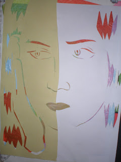
This time working from another picture. With this, I used two different types of paper, the right being ordinary printing paper, and the left being sugar paper, which gives a rather distorted look. The backdrop was tissue paper instead of the coloured card this time.


ILLUSTRATIONS FROM PRIMARY IMAGERY

These are some sketches done from primary photos (photos that I have taken myself) of a classmate. I chose to have them looking troubled and deep in thought, as this matches my theme for the personal project. The medium used were fine liners of different thickness and size as well as markers. Although fine liner is a good medium for sharp and crisp lines, it does have limited properties (and you can't rub out a mistake like you can with pencils).
Studies of eyes from fine liner. Here I have made sure to use different marks, including cross-hatching, dynamic lines and circular lines. The fine liners used are of different thickness for different lines.

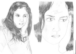
Another two sketches from primary imagery, but this time using graphite pencils. Graphite is a good medium to use, as it allows you to do things you can't do with fine liners, such as smudging to add definition, however this can be a disadvantage at the same time. In this study, I have used more detail, which can be seen in the hair. As you can see in the hair, there are light and dark to tones, where I have applied pressure on the pencil in the different areas to add definition to the hair. The lines made are continuous and sinuous, which I personally think conveys the hair realistically. The close-up study on the right has had the same pressure applied to it, except that the marks on the hair are straighter and more dynamic than the hair on the left hand study. The  pencil marks in the eyes are noticeably different too- pressure has been applied which becomes less towards the left sides of the pupils, using short and quick lines to achieve this.

I think that graphite would be a good material to add dramatic effects to the study, which I think would be good for my theme of loneliness.