Wednesday 29 February 2012

STORYBOARD MEMORIES

                      
I did a storyboard on  5 events that I had experienced. Each with a brief drawing to illustrate these experiences. The first one tells of when I met an uncle when I was 8, and him telling me to lose weight in a way, I felt was harsh. The second one tells of when I lost weight, but was quickly put back on again when I entered high school.
The third part tells of when my team won Sports Day for the first time since being at high school. It was a huge celebration, as our team was always the laughing stock when it came to Sports Day. The fourth is about when my cousin was born, and I had to hold him. I wasn't used to holding babies so I was quite scared that I'd drop him. And the last is about entering college, and how I found it hard to make friends,

Monday 27 February 2012

SYDNEY OPERA HOUSE SHEET

I had to complete a worksheet about an art installation of the Sydney Opera House by Darcy Prendergast ad his friends. On this sheet, I was asked about what materials he used to make the installation, the purpose of it, if I liked it or not and some keywords to describe the piece. I thought quite highly of the piece because of the tremendous amount of effort that went in to it, the originality and high level of detail.

Wednesday 22 February 2012

OBSERVATIONAL DRAWINGS


These are observational drawings from a paper crane, a self portrait, and different boxes and books which are associated with my packaging project. I made drawings from different angles, and used different medium such as pens, pencils. Instead of drawing the outlines of a shape, I tried drawing it from the negative space in the first drawing.

Tuesday 21 February 2012

SELF PORTRAITS OF OTHER ARTISTS/DESIGNERS


These are self portraits of artists such as: Andy Warhol, Vincent van Gogh, Henri Matisse, Francis Bacon and Frieda Khalo.

RESEARCHING AND RECORDING


I did some paper manipulations with my photos. I used techniques such as tearing, curling using scissors and paper weaving.
For this experiment, I used Adobe Photoshop and  I used a colour effect.
I used Photoshop again, and I turned the picture negative.

I also did some drawings from life, using different medium. This was to see the effects of using these medium

A sketch in pencil of my sister. Pencil is good for shading and is also user-friendly as you can erase a mistake you make, but the shading isn't as advanced as the charcoal.
A sketch of my mum using a charcoal pencil. Also good for shading but probably more so than the pencil, and is soft. Although charcoal can smudge and can damage the drawing.
A sketch of my brother using a biro. Biro can also create tone, but I don't think it's as user-friendly as the pencil as you can't rub out a mistake. This was emphasised by the mistake I made from the drawing of the lips. I had to settle with what was already there, or neatly scribble it out.
A sketch of my dad. I used charcoal pencil again. To create a more even tone, I used an eraser to lightly rub out some of the charcoal. However, this didn't really help, because if I press too hard on the rubber, it erases the drawing as well as the tone, but pressing lightly wouldn't make much of a difference.


Tuesday 7 February 2012

ANALYSIS-KIM WELLING

Images from Kim Welling website
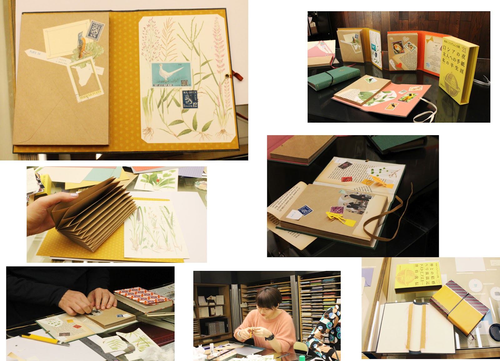
These are 3D models of paper inside of a brief case made by Kim Welling, called 'Panorama Boxes'. What they were made for is unknown, but they could have made for an exhibition at a gallery, which show the viewers of her possible experiences and encounters. Welling started the creation of these in 2009 and finished two years later.
These pieces may have been hand drawn, possibly with the use of fine liner or biro pens, along with paints, possibly watercolour, or she could have used tissue paper and cardboard for the models, as it is sturdier than paper, which could have been hand cut. The colours used are noticeably vibrant, which could represent the good times in her life, which could be further emphasised by objects which are associated with positivity such as flowers. The scale of the models is obviously small in order to fit into the briefcase, but the case itself may just be the size of an ordinary briefcase, which is medium sized. Also the composition of the piece looks fairly organised, as the text seem to be grouped in the same area, as well as the models. 
As stated before, the title of this piece is 'Panorama Boxes', which could affect the way a viewer sees the piece. In the way it's presented, a landscape style emphasises this, or scenes of her life which is unfolded before the viewer. Or, the fact that it's inside of a brief case may symbolise her life in a "nut shell" or "brief case". The theme of the piece may also be her own experiences and encounters, which links in with our exam theme. Also included, are drawings of people, who could be people whom the artist knows, and who she may share a relationship.
I do like Kim Welling's work, as it's a creative and meaningful way of showing your experiences and encounters, and is colourful. It would serve as an inspiration for my final piece, as it's something I can relate to, in terms of personal experiences.

ANALYSIS-JENNIFER BOXHORN

Images found on the Jennifer Boxhorn website.
These are self portrait packaging made by Jennifer Boxhorn. Boxhorn is said to be a "creative, mechanical and meticulous" person, which explains her geometrical design. The packaging may have been made in 2011, and was possibly made for a competition.
Boxhorn stated that she planned the dimensions by using Adobe Illustrator. This could have been done by using the geometric shapes provided on Illustrator, or using straight lines to construct the shapes. She also may have printed the the shapes, possibly spray mounted the paper on to card, and hand cut it out, writing statements in pen. The boxes themselves are crafted in the nature of Russian nesting dolls. There is very little use of colour, only featuring black, white and green. The black and white was to symbolise that she "appreciate finding answers, definite solutions to problems". And green just happens to be her favourite colour, and that she is "green inside" as written by Boxhorn herself. The statements on the outside of the boxes become more personal as each box is revealed.
I hold Jennifer Boxhorn's packaging in high regard, because it's a really creative way of self-promoting, and I personally think that it's more creative and mechanical than Kim Welling's 'Panorama boxes'.It's also something that the viewers can relate to, as we all have something personal to us.

ANALYSIS- HELLO SANDWICH

Images found on the Hello Sandwich blog.
These are book files and collage materials made by Hello Sandwich. They were possibly made for an exhibition at the New York Gift Fair, and they were probably made in 2011.
The method of making these may have involved a lot of meticulous hand cutting and folding, with no use of CAD programs like the other designers, but using materials such as cardboard, as they are sturdy as well as paper. As it is a book file, the book may have been purchased, and then had the pages ripped out, and the front cover kept. And then cardboard pages may have been glued in.There isn't a lot of use of colour, but it mostly consists of warm colours such as yellow, orange and pink, possibly to symbolise the good parts of the designers life, or maybe to a generally positive look on life. Also, there are images of random pictures which may be the things that the designer likes. The composition has a random structure to it, as the images are placed in different locations all over the pages.
I like this piece as it is another good way of telling a story about someone's life experiences. Also, from the outward appearance of the book, it seems that a lot of effort and time went into it, making it look almost perfect. Although, it isn't an original idea, as a lot of designers take up this idea.

Friday 3 February 2012

MY EXAM BRIEF

I have chosen the Packaging Brief, in regards to self portrait.

  • Why have you selected this brief?
  • Because I see it as a chance to reflect back on my life so far, and the experiences that I have had. Also, it's an opportunity to be really creative, as a lot of outcomes can be done.
  • What are you planning to look at for primary/secondary research?
  • Different creative outcomes that convey the same idea of reflecting on their life so far
  • Which artists/designers will you be looking at (you must select a minimum of 3 from the brief)
  • Designers I will look at are Jennifer Boxhorn, Lucas Samaras, Kim Welling and Hello Sandwich.
  • What materials/techniques would you like to experiment with? 
  • I would like to experiment with different medium such as graphite, pastel, chalk. And techniques on programs like Adobe Photoshop.
  • Which outcome(s) are you planning to make?
  • A kaleidoscope-like packaging, in which the viewer can look into and turn a dial, showing them different stages of my life and different experiences. Or, like Hello Sandwich's style, a pop-up book, showing my different stages of life.

EXAM PROJECT: PACKAGING MOODOARD

ONE: Kim Welling 'Panorama boxes' TWO: Sophia Georgopoulou 'Plant your dreams and let them grow THREE: Baby self portait  FOUR: Self-portait 'an older picture' FIVE: Jennifer Boxhorn self-portrait SIX: Wierd Palace self portrait SEVEN: Jennifer Boxhorn self-portrait EIGHT: Hello Sandwich timelife book

EXAM PROJECT:TYPOGRAPHY MOODBOARD


EXAM PROJECT: BRANDING MOODBOARD

ONE: Delhi 2010 Commonwealth games logo TWO: The Olympic Rings THREE: Wenlock and Mandeville London 2012 mascots FOUR: Official London 2012 Olympic games logo FIVE: Glasgow 2014 Commonwealth games logo SIX: Paralympics logo SEVEN: Youth Olympic games logo EIGHT: Olympics 'mind the gap' poster

EXAM PROJECT: ILLUSTRATION MOODBOARD

ONE: Danny Allison 'Africa in Motion' drawing  TWO: Lucinda Rogers '14th Street Subway booth' THREE: Zoe More O'Ferrall illustration FOUR: Japan Bullet train  FIVE: Lucinda Rogers New York Drawing SIX: Lucinda Rogers Ben Freedman,Orchard Street SEVEN: Hennie Haworth 'Weiden and Kennedy advent calendar' illustration

Wednesday 1 February 2012

EXAM PROJECT: MINDMAP

This is a mind map of the possible projects to work on for the exam: Illustrations for a City Guide, Typography, Packaging or Olympics Advertising, including the possible outcomes for each area and artists and themes.