Friday 27 April 2012

MULTIPLE EXPOSURE


This is an experiment of Multiple Exposure. This involves taking a photo or a drawing, and adjusting the 'Opacity' of the image, to give it a faded look. The woman with the brown hair at the top left is my main subject matter, Nell, and below her is her older sis, Lizzy (you could probably tell that they are sisters from the poem in the background).

INSTRUCTIONS:
  1. Open a new document in Photoshop, and open up a background by clicking on 'File', and then 'Open'. Choose you background. This will become the Background layer.
  2. Then from, your desktop, drag another picture on top of the background, and place it where you want.
  3. Then, in the Layers section, on the right, click on the drop down menu, and select 'Screen'.
  4. Then, with you overlapping image, adjust the 'Opacity' until it looks fadey to your liking.
AND THERE YOU HAVE IT!

I quite liked this experiment, because for a while, I've wanted to know how designers achieve this sort of effect, and now....I KNOW HOW TO DO IT!!! WOOHOO!! And it also shows some sort of reflection on my main character's part, as to how someone in her life has been to her, the type of relationship she's been in. I might also include it in my final exam...


MINIMUM TARGET GRADE

Currently, my ALIS Target grade is a C. But, I am also currently working above that grade, and I'm predicted a B grade.

I have also managed to meat some targets. For example, I created some pop-up mechanisms, which I could feature in my final outcome (which I still need to upload). In addition, I also completed some experiments, which involved creating a three colour photo, and text with a watercolour effect.

And there are also my embossing and lino cutting experiments.

Thursday 26 April 2012

POP UP MECHANISMS

For this experiment, I made some pop up words and a few mechanisms.


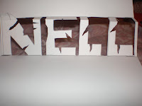
This is a pop-up word. Creased letters on a square box.I used the name of my subject for my final piece. The crease would lie in the middle of the letters and they are formed by the front and the top of the box. As you can see, the letters have been torn at, to emphasise my subject's depression and suicidal thoughts.

At a better angle (at least now, you would be able to read the name). Although, it is quite difficult to read from the angle previously shown because of where the crease is.

INSTRUCTIONS: 
  1. Type up or draw your chosen text, and draw a box around it using a pencil. Through the middle of letters, draw a green line. For the letter outline, use a blue pencil, and use a red line for across the paper.
  2. Using a scalpel, cut on the grey lines. But DO NOT cut around the letters yet. Score and mountain fold (fold inwards) the green lines, and score and valley fold (fold outwards) the red lines
  3. Pop the box out, by using your finger and push from the back. This creates the box.
  4. Cut around the letters in order to complete the pop-up word.
  5. Cut some parts out of the text, to give a spoiled and trampled effect.


This is the same pop-up word experiment, but the difference is that the crease lies towards the top of the letters instead of in the middle. By doing this, it makes the word easier to read. Again, the letters have been cut in some places for her suicidal feelings. (Instructions on how to make this, is the same, except for the green line going through the top of the letters instead of through the middle).

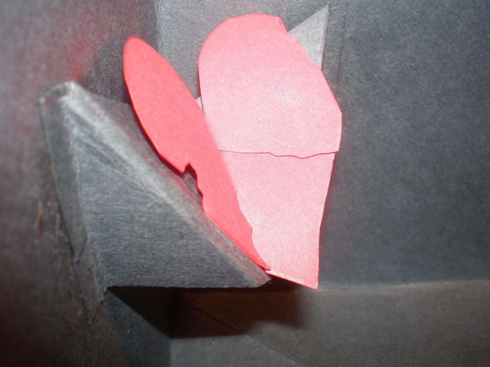
This is a V-Fold mechanism. In the middle is a heart attached to a V-fold, made with part of my circle flip book. When fully opened, the heart will "pop out" of the page of the flip book at a full 90 degrees.

This is what it looks like when it is slightly closed.

INSTRUCTIONS:
  1. Cut a strip of card, approximately 40mm wide. Also include tabs at the end of both sides of the strip.
  2. Mountain fold the strip of card, and valley fold the tabs.
  3. On the card base (the card you want to stick it on), paste it in the centre, making sure that the strip is flat.
  4. Glue your design on top of the mechanism, and leave for a few minutes. There is your standard v-fold.


This is an inverted V-fold. This is similar to the standard v-fold shown previously, except that the fold is folded in instead of out. I have to admit that this one was a bit challenging, because with my first attempt, I didn't quite get the folding right. I kept on folding the lines in the wrong direction, which would end up not becoming inverted but folding out- the OPPOSITE of what I wanted to achieve. 

A side view of the inverted fold
Again, the heart was used, which was cut and torn in some places for my suicidal subject. 

The mechanism when page of flip book is fully opened. I intend to use this mechanism in my final piece. But instead of using a heart, I may use a diary entry from my subject, which will fold out to reveal itself to the viewer.

INSTRUCTIONS:
  1.  Get a square piece of paper and mark that paper with dotted diagonal lines and vertical dotted lines.
  2. Cut out the marked paper, and fold and unfold it in half vertically, and the diagonals too.
  3. Decide how wide your tab measurements should be, and cut off e.g.1/4 of the segments from the top and bottom.Cut the paper in half horizontally. This should leave you with 2 v-folds.
  4. Mountain fold (fold inwards) the diagonal lines, and Valley fold (fold outwards) the middle dotted line.
  5. Flatten the v-fold, and glue the tabs in the middle of the card you want to place it in.
  6. At this point, the inverted shape should be present in the middle of the fold, like a V shape. There is your V-fold.


  These pop-up mechanism ideas and instructions are from Extreme Cards and Paper Crafting.

THREE COLOUR PHOTO EXPERIMENT


This is an experiment of a drawing with three colours, inspired by Miles Donovan. I used on of my surface pattern ideas for this experiments, so what I did was duplicate the background layer, and then go into 'Image', 'Adjustments' and then 'Levels', in which I adjusted the levels of black and white to contrast. After this, I duplicated the previous duplicated layer, giving me three layers altogether so far. I hid the second copied layer by clicking off the 'Eye' icon I clicked back on to the first copied layer, then went to 'Image', 'Adjustments' and then 'Threshold', and adjusted the threshold level to about 210. Then I needed to delete the white parts by clicking on 'Select' and then 'Color Range'. Here, I adjusted the fuzziness to 200, made sure that the 'Image' was clicked on instead of 'Selection'. After clicking OK, the white parts of the image were selected, which I deleted, by pressing the delete button, and deselect by pressing 'Command D', and then clicked off the eye symbol of the first background layer, and clicked on the first background copy, then clicked on 'Image', 'Adjustments' and then 'Hue/Saturation'. I clicked on 'Colorize', and chose some appropriate colours. This completed my first background layer. Click back onto the second copied layer, and click back on the eye icon. Once again, I head back into 'Image', then 'Adjustments' and back into 'Threshold', and clicked on the lighter contrast. When finished adjusting that, I clicked on 'Select', then 'Color range', and then clicked on the white areas, again making sure that the 'Image' instead of the 'Selection' option. Then I pressed the 'Back space' button, and then deselected (Command D). Then I created a new layer, and placed it underneath the two background copies. I filled the layer with white (or any other colour), giving me my three colour photo.
I quite liked this experiment, as it allows you to adjust the contrast in black and white EXACTLY how you want it. It also gives the picture a  sense of realism to it. I may consider using it in my final piece, because I think it fits well with my subject's negative, suicidal attitude (but I would adjust the the contrasting a little more).
                                                                           

Tuesday 24 April 2012

REVIEW OF IDEAS

Since the beginning of this project, my ideas and concepts have changed a significantly. In the beginning, I still wanted to work on the same exam brief of self-portrait, but I was so intent on making some sort of packaging, and that it was going to be about myself. Until recently, I decided to change what my final outcome was going to be, and who it was going to be about. I decided to change the final outcome to be a circle flip book (or two), and the subject was going to be about a fictional suicidal person.
Also, since the beginning, my ideas have also changed as a result of experimenting with different techniques. Some of these techniques include lino printing, embossing and rubbings, a watercolour effect typography, and by doing these experiments, I have plenty of choices as to how I will create drawings, which I will include in my final outcome to make it more engaging.
Also, by looking at different artists and designers such as Rankin, Filip Peraic, Hello Sandwich just to name a few, my ideas have also changed as a result of researching and analysing their work in an in-depth  way, and has also made me look at their work in a different way as well. By looking at their work, it has provided me with more methods of creating an original outcome.
Maybe my work will continue to change in terms of the outcome and subject, but as for now, I highly doubt it...As of now, I don't have any more ideas for experiments do to, but maybe in the near future, that would change (hopefully before the exam rears its ugly head). But, because my subject is about a suicidal person, and I am into Japanese stuff, I will do some research about Suicide in Japan, as the suicide rate there, is VERY high, one of the highest in the world.

Sunday 22 April 2012

SURFACE PATTERNS

I also managed to create some surface patterns, which I could use for my final piece.
                                                                         
This surface pattern idea was used with wrapping paper, arranged in a pattern by cutting strips of each paper, and gluing them in turns. This was before I decided that my final piece would be about a suicidal person, so obviously this wouldn't suit it ALL ( not with these kinds of wrapping paper anyway).

This was created using watercolour paints and obviously pencils (for the outline of course). The first four people are the people involved with my main subject, whether it be family or not (for example a bully). As you may have guessed, the last person is of course my main subject, and the gun below...is what she will use to blow her brains out...or won't she? The title of this is called 'The Gun' because by using it will change the people she knows either for better or for worse.

These are splatters of blood made by using watercolour paints. They represent the outcome of my subject pulling the trigger.

This, yet again is splatters of what was supposed to be blood, but then again using a wet tea bag, crushed strawberry juice and crushed blueberry juice wouldn't pull that off as effectively as watercolour paint. So it's just splatters of...stains really. Using those three ingredients mentioned before was a crazy alternative to using predictable red paint or ketchup (this took about 3 days to dry!).

Also, I created this using stamp patterns and cut out letters from newspapers to form the sentence 'Life is Overated', which again fits in with my subject's negative outlook on life. Using this, or some other negative message about life, could just seal her fate...

For this, I used a similar resources such as the patterned stamps, but instead using Japanese characters. Although, the meaning of these characters are opposite to the kind of thoughts that my subject thinks about, their meanings are of positive things such as eternal, laugh, life, love. But they could be used to alter her mindset, and therefore change the outcome of the story...Who knows...
                                                                               

PACKAGING TRYOUTS

For my exam brief (Self portrait), I need to have made either some sort of package or a storybook. I managed to try completing some nets, most of them easy, a minority weren't.
                                                                                 
This is a completed net of a cuboid, twisted at 120 degrees. This was a bit of a challenge, as I tried many attempts to get the folding as best as I could, in order to make it have a twisted appearance. But I managed to  do it (after 5 attempts).
This is a flip book in the shape of a circle.  This involved cutting four circles of the same shape, and gluing them back to each other. I thought that this was quite clever, because it can be folded to look like a book. This wasn't so hard to make as the twisted rectangle, and didn't take as long. Maybe I could make two of these and one fold out into another. I might just try that...

This is a completed net of a holder. Initially, I thought it was the net of a cube, but I couldn't get it to form a cube. Instead, it turned out to be a container, which could be useful for example for holding trinkets, letters and photos of a subject matter.

This is a squash book in the shape of a square. This is quite similar to the circle flip book shown earlier, except for its size, and the way it looks when unfolded. (This design actually lead me to finding the circle shaped version). At first, it was fairly simple to make, but folding it back proved to be a little difficult, because I didn't fold the paper in the right direction sometimes.

This is what it looks like when folded open.
                This is a cubic shape. This involved making one cube (although it wasn't a complete cube), and gluing a smaller (incomplete) cube on top of it at a certain angle. After much aggravation, it turned out to be a success. It was quite difficult to place the smaller cube at the correct angle, as the bigger cube would sometimes come apart.


DESTROY BY RANKIN


Images found on the official 'Destroy by Rankin' website
These are a series of photos by a photographer who goes by the name of Rankin. It was for a project called 'Destroy', made to celebrate the 10 year anniversary of a charity named Youth Music, by taking the pictures of 70 musicians and celebrities and "destroying them". The year of this event was in 2009, so it can be wise to suggest that these photos may have been taken in the same year (or possibly earlier to prepare for the event).
These photos would have been taken by the photographer, and then possibly manipulated using either a graphics software such as Photoshop, and using different techniques, such as Guassian Blur, or made a copy of the photograph and painted over the faces.Or, in one case could have hand cut a the subject out of the picture, and  inserted a  newspaper article in place of the subject. This may have been done to emphasise the beauty of these  pictures being "destroyed", and the identities of the subjects are therefore taken away. Where there are paintings, there hasn't been much use of tone or texture, but they seem to be somewhat flat (meaning that he, or someone else could have most likely use acrylic paint).
With these photos, it would be wise to suggest that these are portraiture, but they could also be classified as contemporary, because it's a modern way of showing off portraiture. The reason as to why the photos are made they way they have, is unknown but may how the subject views themselves. For instance, cut out figure replaced by a newspaper may feel like he has lost his privacy altogether, and that it has become a huge part of his life, or the people whose face have been painted over may represent them having to be who they really aren't and replace it with a different personality that is sure to be appreciated by others, hence the meaning of feeling 'destroyed'. Because of the unknown reasons, the title of the piece leaves it open for imagination and different interpretations, something that differentiates from a book, where the feelings and events are "spoon fed" to the audience.
When first seeing the works, I was quite disturbed, because of how the subjects faces and figures were taken away, almost like some sort of nightmare, where I was surrounded by many defaced people, and I was the only one who wasn't (I have weird dreams).  But despite this, I do like the photos because it's a different way of showing the possible feelings of the subjects, instead of going along with the traditional way of just showing their facial expressions. And because of this, I would like to use this method in my piece, when showing photos of my subject's family and of herself.                                                             

Friday 20 April 2012

WATERCOLOUR EFFECT

This is an experiment making a watercolour effect on Photoshop.
To do this, I started with a 'Background Layer', which I used to select a background, by double clicking on that layer. This lead me to 'Pattern Overlay', where I chose the background, and changed the 'Opacity' to 10% and the 'Scale' to 10% too, to achieve a watery background. After doing this, I clicked on the brush  tool, and changed the 'Hardness' to 35 pixels, and then clicked on 'Brush' under the 'Windows' tab, opening the brush options. There, I changed the texture of the brush under the  'Texture' tab, by choosing the same texture as the background.  Then I went on the 'Wet Edges' option, which will give me that watery effect of the brush, like a real brush. After this was done, I made sure that the 'Opacity' was at 20%, and that the object was on the 'Multiply' option.
Next, I created a new 'Text' layer, on which I typed some text (ideally relating to my exam brief).Next, I created another new layer, where I outlined the letters of my text, using the magic wand tool, click off the eye symbol from the 'Text' layer, so that I was only left with the outline made by the Magic Wand tool.This then allowed to use the brush tool to fill my text with colours, but altering the 'Opacity' to 10% and the 'Flow' to 50%, which allowed my achieve watery colours.When this was done, I deselected the wand tool effect by pressing 'Command D', leaving me with the watery text effect, and then remove the 'Text' layer. I quite liked this experiment because it's creative, and very easy to colour in the text, and it allows for some creativity. To develop this further, I could add some filtering effects for example Plastic Wrap or Graphic Pen, to emphasise my subject's negative outlook. However, I don't think that I would be using this for my final exam, as I don't think it relates to my final piece as much I would have liked it to, because the effect is too soft to be included in a piece about a rather difficult and hard subject such as suicide.