
I went to the 'Pick me up' exhibition today. 'Pick me up' is an exhibition that showcases the work of graphic designers, including Maricor/Maricar, Hattie Stewart and Malika Favre, and is held at Somerset House in Westminster. There were many exhibitors there, but there some people that I thought stuck out the most.


One of these people was Katie Scott. Scott graduated from Brighton University with an Illustration degree and is influenced by the aesthetics of her subject matter. The above are two pieces of her work which I liked. With the first one, there is a multitude of colour, and she has conveyed the texture of the snake skin really well, and very convincing. With the second one, it's obvious that it's a monochrome, there is a great deal of detail, and conveys textures well. The patterns at the bottom are very intricate, and resemble the patterns that you see in a kaleidoscope.


Another is Hattie Stewart. These are part of her 'Doodle bombing' series which involves hand drawing over magazine covers. She has a rather playful style, which made me take the covers less seriously. I think that the work reminds me of hallucinations from some sort of psychadelic drug.


One of the best, I thought was the eclectic work of American born Ping Zhu. She uses a range of media such as gouache, pencil and watercolour. Her mark making was really good, and she had a variety of these as well. Sometimes she would use cross-hatching, or swoosh-like loose marks or just fill in solid colour. As you can see in the pencil study, the hair has these dark dynamic straight lines, and the back, neck, face and shoulders have the same lines, but they seem to cross each other to create these geometric patterns, which allows the muscles to be defined too.


These are two of American born artist You Byun's work. Having been raised in the US, Korea and Japan, she draws from the cultures that she has experienced. Her work has a surreal and whimsical feel to them, and includes delicate details rich colours. I couldn't help but think that there may have been a hint of nostalgia, as these look a bit like illustrations from children's story books.
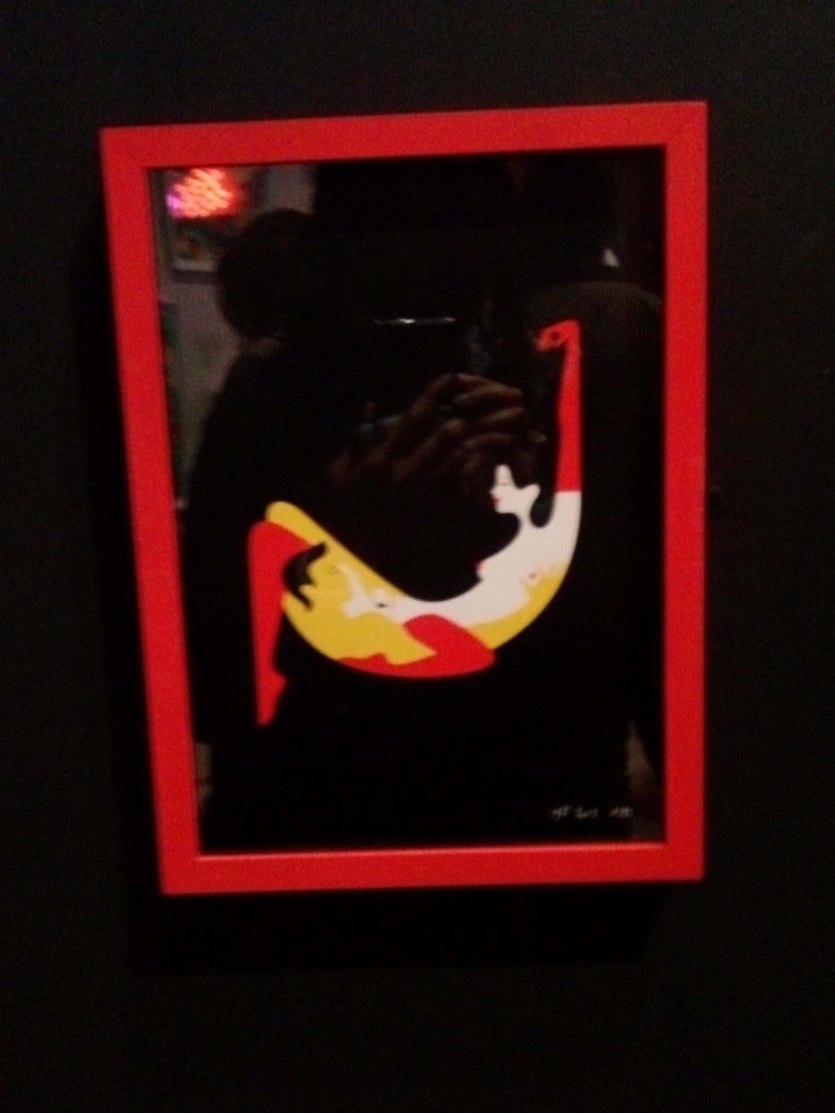

Two of Malika Favre's 'Kama Sutra Alphabet Series' letters J and B. As you can see, these are very erotic and explicit, and she adheres to her statement that "less is definitely more". I thought the limited colours were good in drawing the attention to the subject matter, and the simple composition helps the viewer to decipher which letter is being demonstrated.
Overall, I really enjoyed the exhibition, and how they were considerate enough to leave a trail leading the room where the exhibition was taking place.What made it stick out, was that it was interactive. it wasn't just an exhbition where you just looked around at people's work, but you could get involved and make you your own t-shirts, make name tags and take part in their workshops, so it was definitely worth the price. It did give me an insight to the kind of work people do at University, the high standards of the work, and what kind of career I could progress on to after graduating. The whole idea of less is more definitely applies to my book jacket project that I'm currently working on.
No comments:
Post a Comment