Tuesday 30 April 2013

PRIMARY IMAGERY

In order to compose my final outcomes, I will of course need some imagery to work with. But it has to be my own images instead of ones collected from other course, such as the internet for copyright reasons.
For each of the three books I am working on, I have collected the appropriate imagery for what I am trying to convey.


The following are for '1984'.


This person will be representing the male protagonist, Winston. I have chosen for the facial expression to be blank to convey the somewhat serious nature of the book, as well as the hopelessness of the situation he is living in.


This rather sinister looking eye will be representing how the political party watches over every move of their citizens. 


This person will represent Julia, the female protagonist. Again, there is an expressionless face to match "Winston's". She will on the back cover, with the Party's slogan "War is Peace, Freedom is Slavery, Ignorance is Strength".


Group of people. They will be used to represent the ordinary people whose movements are watched by the Party. They will be silhouetted to symbolise this.


The following images are for 'A Clergyman's daughter'.


This person is posed as if she has been crucified. Since there is a religious theme in this book, I thought this would be appropriate to include, because it also symbolises how the protagonist, Dorothy is at the mercy of her father, especially for a home.


The image of flower was a nice touch. I thought it would add a delicate feel to the cover.


Image of a church, again for the religious aspects of the novel.


Some ivy. Ivy is said to symbolise dependence and attachment, so I thought that this would be appropriate since Dorothy is dependent on her father, both for a home and to get her out of a sticky situation.


The cross for the religious reference. I will crop the cross pendent and enlarge it and the woman from the previous image in a crucifix position will positioned on top of the pendent as if she were being crucified on it.

The following images will be for 'Animal farm'.

Fields with sunset. This would be used to represent the farm itself. I planned to have a field with a sunset in my initial ideas, but instead the sky will be red to emphasise the propaganda style.


My studies of a pig and a close up of an an animal's eye, reflecting a pig's tail.


Saturday 27 April 2013

'PICK ME UP' 2013 REVIEW


'Pick me up 2013' web page

I went to the 'Pick me up' exhibition today. 'Pick me up' is an exhibition that showcases the work of graphic designers, including Maricor/Maricar, Hattie Stewart and Malika Favre, and is held at Somerset House in Westminster. There were many exhibitors there, but there some people that I thought stuck out the most. 


One of these people was Katie Scott. Scott graduated from Brighton University with an Illustration degree and is influenced by the aesthetics of her subject matter. The above are two pieces of her work which I liked. With the first one, there is a multitude of colour, and she has conveyed the texture of the snake skin really well, and very convincing. With the second one, it's obvious that it's a monochrome, there is a great deal of detail, and conveys textures well. The patterns at the bottom are very intricate, and resemble the patterns that you see in a kaleidoscope.


Another is Hattie Stewart. These are part of her 'Doodle bombing' series which involves hand drawing over magazine covers. She has a rather playful style, which made me take the covers less seriously. I think that the work reminds me of hallucinations from some sort of psychadelic drug.


One of the best, I thought was the eclectic work of American born Ping Zhu. She uses a range of media such as gouache, pencil and watercolour. Her mark making was really good, and she had a variety of these as well. Sometimes she would use cross-hatching, or swoosh-like loose marks or just fill in solid colour. As you can see in the pencil study, the hair has these  dark dynamic straight lines, and the back, neck, face and shoulders have the same lines, but they seem to cross each other to create these geometric patterns, which allows the muscles to be defined too.


These are two of American born artist You Byun's work. Having been raised in the US, Korea and Japan, she draws from the cultures that she has experienced. Her work has a surreal and whimsical feel to them,  and includes delicate details rich colours. I couldn't help but think that there may have been a hint of nostalgia, as these look a bit like illustrations from children's story books.


Two of Malika Favre's 'Kama Sutra Alphabet Series' letters J and B. As you can see, these are very erotic and explicit, and she adheres to her statement that "less is definitely more". I thought the limited colours were good in drawing the attention to the subject matter, and the simple composition helps the viewer to decipher which letter is being demonstrated.

Overall, I really enjoyed the exhibition, and how they were considerate enough to leave a trail leading the room where the exhibition was taking place.What made it stick out, was that it was interactive. it wasn't just an exhbition where you just looked around at people's work, but you could get involved and make you your own t-shirts, make name tags and take part in their workshops, so it was definitely worth the price. It did give me an insight to the kind of work people do at University, the high standards of the work, and what kind of career I could progress on to after graduating. The whole idea of less is more definitely applies to my book jacket project that I'm currently working on.

PREP WORK EVALUATION

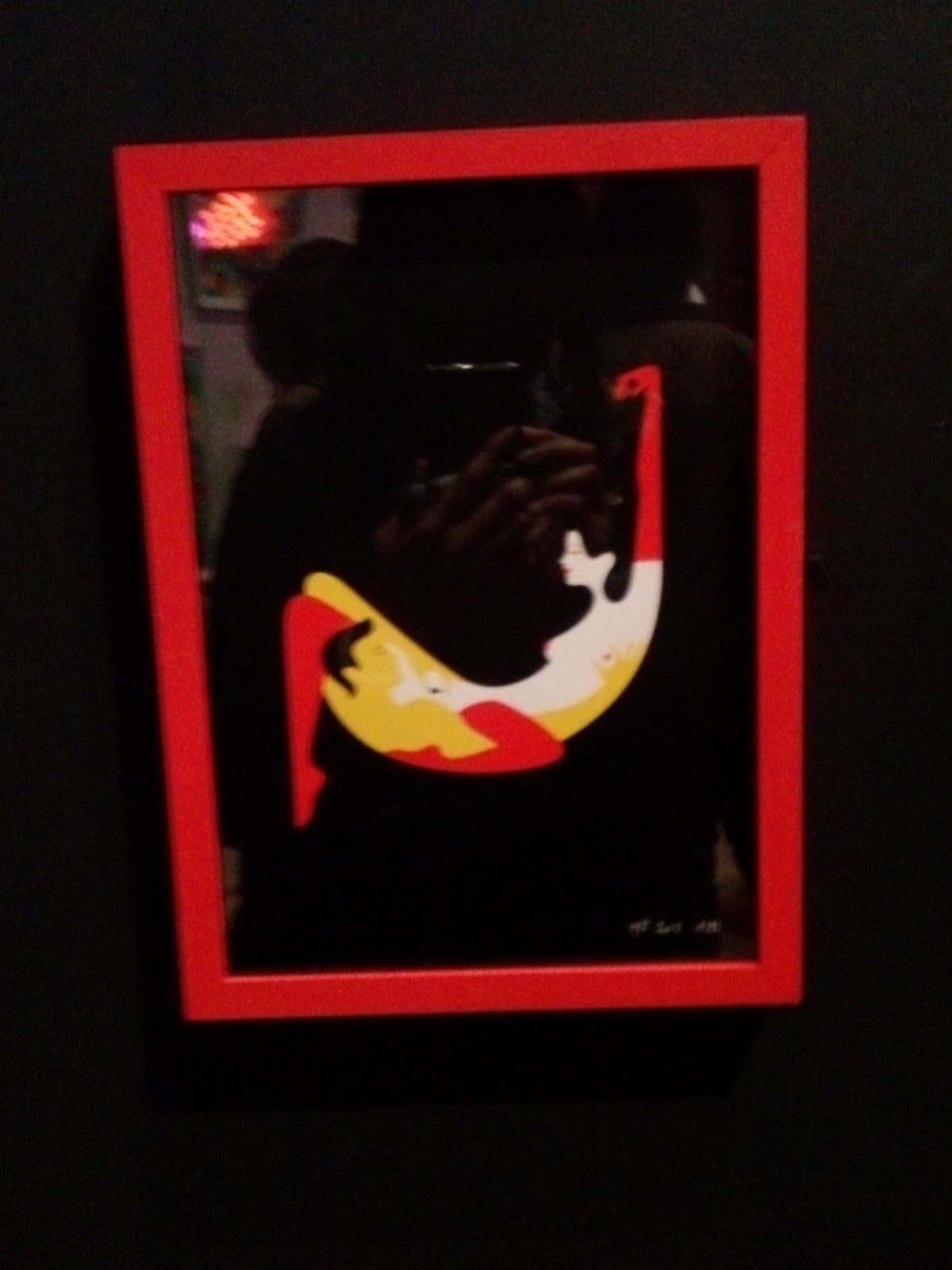
INTERPRETING THE THEME

The theme for this exam project was 'Inside, Outside, In between. And my chosen outcomes were book jackets for George Orwell novels '1984', 'Animal Farm' and 'A Clergyman's daughter'. The objective was to be minimalistic- representing the book using minimal objects. So, when it comes to my final outcome, the minimalistic appearance allows the reader to understand the possible theme of the book (Inside), but at the same time the front cover does leave unanswered questions about the plot, the protagonist and antagonist (Outside, In between). So in a way, the viewer is "in and out" of knowing what the book is really about, and only when they read the book do they understand.

RECORDING OBSERVATIONS

To record observations, I collected both primary and secondary imagery, as well as observational sketches from these images. This included timed drawing exercises, using different media. Also, I explored mark making and collages.

IDEA DEVELOPMENT
For '1984', I wanted to create this aggressive brutal look.


So initially, I did some digital experiments, one of which involved horizontal and vertical panels, with a black and white photo of a subject.


and another one using multiple exposure, setting the different light settings. Although they were successful experiments, I thought that they were still too simplistic, and I thought I could try something more complex,  that requires more skill.


MATERIALS, TECHNIQUES AND PROCESSES

For this project, I have used a range of materials. In my workbook, I used fine liner pens and sketching pencils for the observational studies, as well as graph and coloured paper, newspapers, old envelops and magazine cutouts for my collages. As for the digital, Photoshop and Illustrator were mainly used. However, I did make use of an iPad to use iFontmaker to create my own font. But out of all of these, I would say that Photoshop and Illustrator helped me to realise my final ideas, especially with the Brush tool and the variety of shapes you can use there. With Photoshop in general, there were some constraints. For instance, the layers system took a while to get used to. If I wanted to change colours I filled with, and I didn't make a new layer, then instead of changing an individual feature, everything else would be changed. So to avoid having this problem in the exam,  I had to make sure that when I wanted to add something new, I would need to create a new layer so that it can be changed a later point.

INFLUENCES

For this project, I had three main influence: Chris Parks, Rodchenko (Constructivism) and Clunie Reid.
With Chris Parks, it was his great attention to detail and his varying brush marks to convey different textures. Despite the lack of colour in some of his works, the detail always makes up for it. This is what I want to try and mimic in the exam.


In regards to Alexender Rodchenko and Constructivism, I like the limited colours, bright vibrant colours to give a sense of alarm and the bold typeface that grabs the viewer's attentions, as seen with Russian propaganda posters. This is what I want to try and incorporate in the covers, particularly '1984' and 'Animal Farm', as they are politically themed novels.


With Clunie Reid, her illustrations include these  thickly outlined geometric shapes with straight lines close to each other, which I thought this gave her work an aggressive and forbidding appearance. This is the feature that I would like to include in all three book covers to convey an aggressive look.

FINAL PIECE

As I said before, I am hoping to create three book jackets for three of George Orwell's novels: '1984', 'Animal Farm' and 'A Clergyman's daughter'. For all of these book jackets, I intend to work in the style of Chris Parks's screen printing, and use the different brush marks where appropriate. They will be created digital mainly via Photoshop and Illustrator and possibly using an iPad for iFontmaker.  As the three books have differing meanings and themes, the imagery will be different. Firstly, 'A Clergyman's daughter' is about religion, submission and liberation, so I thought using the main character on a crucifix would be good to show the submission aspect. For '1984', the citizens' every move is watched by the political party in power, so having eyes is an important element to include to show this. For 'Animal Farm', it is inspired by Russian politics, particularly Socialist ideals and Soviet Union, so the propaganda element is essential in conveying this. For this, making use of heavy lines, like Clunie Reid and stars are frequently used objects in propaganda, so I will include these.

As you can see, in this, I have used the screen printing illustration, done on Photoshop, inspired by Chris Parks. I have used a range of brush marks, and sizes using the Brush tool, and the close lines on the eyes like Clunie Reid. However this one does not have the propaganda elements as it is not a politically themed book like the other two.


This experiment isn't thoroughly finished but, it is similar to what I want to achieve by the end of the exam. I have used the typical alerting colours red, orange and yellow, and the main character (in the centre), has a shadow over half of his face. The rats by his side are what he is scared of, and are used a means to torture him. The silhouetted people represent the public who are controlled by the party, and whose activities are closely monitored. Like Chris Parks, I have used different brushes for different textures.


Wednesday 24 April 2013

PUBLISHER LOGO DEVELOPMENTS- victor gollancz

Devlopments for the 'Victor Gollancz' logo.


I chose to work with this idea of initials surrounded in negative space.


I opened up Illustrator, where I decided to take the logo a bit further, by making a 3D logo. This is the 'V' letter, which involved drawing a circle, then typing out the letter of my choice. This letter was put over the circle and then merged together using the 'Pathfinder' option under the 'Windows' tab.


The completed final logo. The two shapes are merged together, and the names have been inserted into the spaces.

PUBLISHER LOGO DEVELOPMENTS- secker & warburg

The following are my developments for publishing company logos.
This is my 'Secker &Warburg' logo, the company who initially published '1984' and 'Animal Farm'. As you can see, I drew the surnames inside of the '&' sign.


After cleaning up the image with the brush tool with white on Photoshop, and then live tracing and colouring it in Illustrator, this is what I got. It's a bit untidy in some places, and adding bits of colour and straightening some parts, it will have a better finish.

The logo after making changes. Compared to the first one, the colour is lighter, there are no white gaps, and the tail is straighter.


INITIAL LOGO IDEAS


These are initial ideas for logos of publishing companies that published the three Orwell books that I'm working on. For '1984' and 'Animal farm' the original publisher is 'Secker & Warburg' and for 'A Clergyman's daughter' the original publisher is 'Victor Gollancz'. When I researched these companies, there didn't seem to be a logo for either of them, so it left some room for imagination.

Monday 22 April 2013

RUSSIAN PROPAGANDA POSTERS


These are three examples of Russian propaganda posters used for advertising a worthy cause, including the support of Communism. It is likely that these posters were illustrated, printed or have some photography in into them, such as the second example by Alexander Rodchenko. Since this is a major inspiration for two of my final outcomes (Animal Farm and 1984), I will analyse these kind of posters.

From these designs, it's likely that these were made during Constructivism movement, a style of art that originated in Russia in the 1910s. The movement is characterised by geometric forms, arranged in an organised manner, which is clearly seen here. One of the easily noticeable features of these posters is their limited use of colour, ranging from black red and yellow.As I stated in my earlier post about colour psychology, these colours are good for making the audience alert and calling their attention. But black gives the impression of heaviness and density, and gives the posters and aggressive look. Furthermore, as seen in the above examples, a lighter colour against the black makes it the cause seem serious. Overall, using a minimum of colours is beneficial in achieving this serious and rather aggressive appearance. Another noticeable feature is the lack of objects, as this may from obscure the viewer from getting the message, so it needs to be as minimalistic as possible to allow a mass audience to understand it. The typeface is bold, simplistic and noticeably in upper case, not only for it to be understood effectively, but also to grab the audience's attention.

I like how simplistic the designs are, as well as their limited colour use to convey the message effectively. The simple typeface is good for this too. The only problem I would have using these features, is that it may conflict with the Chris Parks influence whose works are the opposite of Constructivism- complex and colourful. So it may a matter of incorporating both aspects in a way that looks good.


Tuesday 16 April 2013

SCREEN PRINT IMAGE DEVELOPMENT


This is a development of my previous screen print image. In the previous one, I didn't think it was full enough compared to Chris Parks's works, where most or all the spaces were filled up with objects, so I created a repeated pattern of roses in Illustrator, copied and pasted it into this image, and used the 'Overlay' option. I think that this has improved the image by using up more space, but I think drawing the roses could also improve the image, but then there is a risk of making the image too occupied.


The repeated pattern I created in Illustrator, using the images provided in the program.


Wednesday 27 March 2013

iFONTMAKER TYPEFACE


This my font, created using iFontmaker, through iPad. I wanted to go with a Russian-like typeface, inspired by the Russian alphabet. When using this, I did find it a bit difficult to get used to the controls, but being allowed to change the size and shapes of the brushes allowed some freedom. It also shows more creativity, as opposed to downloading a font from the internet.

COLOUR PSYCHOLOGY

"Colours, like features follow the changes of the emotions"- Pablo Picasso

Colour psychology is the study of colour as a factor in human behaviour. I wanted to research this as I think its important to use the appropriate colours when producing my final outcome of book jackets, so that the colours will help to emphasise the themes within the books.

Colours have more abilities than just making a product aesthetically pleasing, they have the power to affect moods, feelings and emotions. They can also raise metabolism, raise blood pressure and even cause physiological reactions.

In the section below, I will describe some the pros and cons of some of the colours that I plan to use in my final outcomes:
  • RED: Red is generally a powerful colour. It can raise the pulse rate and gives the impression that time is passing faster than it actually is. It also represents warmth, excitement and masculinity, but on the flip side, it can be aggressive and demanding. 
  • BLACK: Black can represent sophistication, substance and glamour and works really well with white. Since it is the absence of light, it can be quite menacing as many people are afraid of the dark.  Black is a dense colour and creates the perception of heaviness.
  • BLUE: Blue is said to be the most popular colour in the world. Unlike red, it is soothing and the colour of the mind. However, it can also represent coldness' lack of emotion and unfriendliness.
  • GREY: Grey is a suppressive colour. While it represents psychological neutrality it can also symbolise lack of confidence, depression and lack of energy.

Tuesday 26 March 2013

DIGITAL EXPERIMENTS: digital screen print


These are my digital experiments using screen printing, inspired by Chris Parks's illustration work. This involved using a source image, which was my digital collage made earlier, creating a new layer, and drawing over the collage. Just as Parks did, I created new layers for each colour, for which I could add and change different colours, without affecting the others. I also made sure to change the brushes, using different sizes and shapes for different areas of the image. I did like creating these, because you are allowed to change your decision, if you didn't like the colours used. Despite this, it did take me awhile to complete it (3 hours approx and that was just for the outline). 

To improve this, I could use more primary images, and with regards to the background, I could create a repeated pattern to make the design a lot more occupied like Chris Parks's works.

CHRIS PARKS aka Pale Horse

"I’ve always just wanted to make a living doing something I enjoyed and not hate getting up every morning. Fortunately, I found my passion for art and design early in life and have been doing my best to master it ever since."

Images from the Pale Horse website


These are some of the works by designer/illustrator Chris Parks, aka Pale Horse who runs a illustrating company also called Pale Horse in Tampa Bay, Florida. Parks has produced works for a range of companies, including WWE, DC Comics and Mini Cooper I will analyse his work for inspiration for my final book jacket outcomes as I will want to use his techniques in Photoshop.

According to the official Pale Horse site, Parks's fascination stems from "mythology and ancient civilisations" as well as being influenced by "heavy metal, pro wrestling, tattoos and psychedelics", most (if not all) his work consisting of portraits. In an interview, when asked about his inspirations, he stated that his best ideas "usually come from when I'm not trying too hard to come up with them", as well as doing some research and some digital layout sketches. 

Parks seems to mostly use digital means to complete his work, usually by Illustrator and Photoshop via a graphics tablet. After looking at his work closely, it seems that he uses the Brush tool from Photoshop, but in different shapes and sizes for texture. His designs are very elaborate, paying close attention to details minor and major. When filling his designs with colour, he uses different layers, naming them after each colour, so that he can separately change them when he wants to, without affecting the other colours. At times, his use of colour is limited, but his attention to detail makes up for it. The scale of his work varies, for instance the first illustration is A4 size (297x210mm), whereas the second pieces are the sizes of two skateboards since they were drawn on to skateboards. Although he does include some typography in his work, as seen in the example above, his main priority is obviously at the artwork itself.

 I really like his close attention to  detail, and his different brush shapes to convey the different textures. Upon first seeing his work, I was amazed at the different shades and marks made from the brushes. 
To some extent, his work does remind me of elaborate patterns seen in some fairytale books from my childhood. When producing my final outcomes of book jackets, I would try to aim for as much detail, especially paying attention in the line art, where the brush sizes and shapes differ.


Wednesday 13 March 2013

DIGITAL EXPERIMENTS: digital collages


These are digital experiments using digital collage on photoshop. Inspired by illustrator and collage artist Ciara Phelan who uses different images in her collages. The experiment involved using images either of my own or I had drawn, or from the internet, and arranging them they way I wanted to. I feel that the first one is better because I applied more thought into the composition, much more than I did with the second version. However, the second version used extracts of drawing, my own images as well as something made in Photoshop, so I used mixed resources.
The first version is for the Orwell book 'A clergyman's daughter, whereas the second was for '1984', hence the multitude of eyes.
Overall, I think this is effective for conveying the inner spirit of the book as it gives you the chance to use images relevant to that book, which is what the brief for this project required.